Every film in the Star Wars franchise is so heavily dissected that finding anything original to contribute to the conversation can be a challenge. But I think I’ve found something, an issue so inconsequential that I appear to be the only person willing to give it any amount of thought. Why does Lucasfilm keep making nearly imperceptible changes to its logo in each of the new movies?
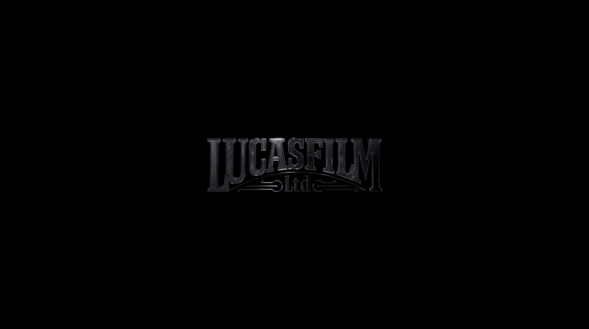
I first noticed this sometime after the digital release of Rogue One, when my life had apparently gotten to the point that I was spending precious minutes of existence comparing the beginnings of The Force Awakens and Rogue One to see if there were any subtle differences. You know, the way normal people spend their time. Immediately, I noticed that the Lucasfilm logo was tiny in Rogue One when compared to The Force Awakens.
Have a look for yourself. You can see the opening of The Force Awakens on the left and the opening of Rogue One on the right.


You’ll notice that the logo is a lot smaller in Rogue One, and it’s also more grey than it is green.
It’s not just the logo, though. The “long time ago” blue text is also different. Here’s The Force Awakens on the left and Rogue One on the right.


It’s way smaller — to my eye, possibly an even more dramatic downsize than the Lucasfilm logo.
So what happened here? Did the folks at Lucasfilm decide to shrink the logo’s size for the spinoffs so that we audience members would subconsciously sense that there was something different about these movies compared to the main episodes? Or was this the new permanent size and color, and it would stay tiny and grey going forward?
Ahead of The Last Jedi, fans debated question upon question about Rey’s parentage and Snoke’s origins, but with this bombshell discovery in mind, there was only one that kept me up at night: what size would the logo be?
In the theater, it was virtually impossible to tell what the deal was, as you can really only see the difference with a side-by-side comparison. But when The Last Jedi came out on home video, I frantically rushed to the Amazon video store, purchased it, and booted it up to uncover the truth like a true investigative journalist onto the biggest story of 2018.
The answer…drumroll please…was that they had gone back to the big green Lucasfilm logo.
It gets more interesting, though. Look closely and you’ll notice that it’s ever so slightly different — this one is for sure a bit more grey than in The Force Awakens. Here’s The Last Jedi on the left vs. The Force Awakens on the right:

Still, it’s more green than the Rogue One one, so it’s not like they just made the one from Rogue One bigger. Let’s take a look at The Last Jedi on the left vs. Rogue One on the right.


So far, then, we have three entirely different Lucasfilm logos.
For the blue text, in The Last Jedi, we’ve now gone back to the same exact size as The Force Awakens. But actually, this time, the text appears to be brighter than it was in The Force Awakens. Here’s The Last Jedi on the left vs. The Force Awakens on the right.

It seems to be about as bright as the Rogue One text but is just larger, so maybe Lucasfilm has finally settled on the right color and brightness for this part of the movie. Here’s The Last Jedi vs. Rogue One.
Now, at this point, I’m sure you realize why I’m writing this post now: because Solo: A Star Wars Story was recently released on home video. Surely, you are on the edge of your freaking seat waiting to find out how the Han Solo origin story’s opening seconds compares to the previous films. Hold on to your damn hats, because here we go.
Would you believe that the Lucasfilm logo is actually different from all three previous films? It’s the same size as in Rogue One, but this time it’s more grey and a little darker. Here’s Solo on the left vs. Rogue One on the right.

It’s also far, far more grey than the Last Jedi logo. Here’s Solo on the left vs. Last Jedi on the right.

So by this point, it’s clear that Lucasfilm is making a choice to have the logo be smaller and greyer for the spinoffs and larger and greener for the main movies. But they can’t even decide on how grey or green it should be.
The last piece of the puzzle is the “long time ago” text, and to my surprise, in Solo, it’s actually smaller than the Rogue One opening! Here’s Solo on the left vs. Rogue One on the right.


So there we go. It’s natural to brush past those first 10 seconds of a Star Wars film, which at first glance look to be copy-and-pasted from the previous entry. But actually, with the new Disney movies, it’s a little different every time, but in such small ways that you wonder why they even bothered.
My theory? Making completely needless tweaks like these, which are surely complete wastes of everyone’s time and add or subtract nothing at all, is Kathleen Kennedy’s secret way of tipping her hat to George Lucas. He would be proud.

Leave a comment